
Alex McManus
December 14, 2022 • 4 minute read
Reviewed by Victor Leung
Fact Checked by The Basiq Team
Out of the box customiseable, CDR compliant consent solution
Our integrated CDR compliant consent UI was the first step in providing fintechs with an out of the box solution to manage the complex nature of capturing customer’s consent to access their financial data. In our first iteration, we enabled customers to quickly edit and configure an application’s consent UI and flow in just a few clicks via the developer dashboard, removing the need to update JSON files. In addition to:
- Personalising text and messaging that greets end users so it aligns with your brand’s tone of voice. All consent policy fields can be configured including duration, policies, text and more.
- Configuring institutions you want to show or hide to end users.
- Allowing multiple institution connections, to determine if your end user should be able to connect more than one institution at a time.
- Preview changes in real time in the Dashboard UI editor before publishing to your live application.
- Determine data management behaviour by choosing how you would like to handle your end users data after consent revocation.
For full details check out the original blog post here.
A consent UI aligned to your brand guidelines
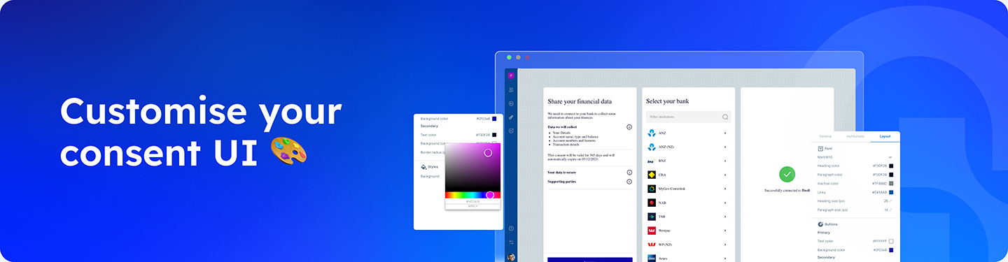
We love levelling up our developer dashboard to empower our customers and their teams to better self-serve for their solutions and this time we’re giving our customise UI consent editor even more functionality.
With our recent update you can now configure the styling of your consent UI directly from the dashboard editor – no need to fiddle with code via the CSS! Teams outside of development can now feel empowered to easily update their applications styling to align with their brand guidelines.
What can you customise?
In addition to everything you could already customise in the editor, go a step further and edit:
Colours
Align with your brand guidelines by updating colours for headings, paragraphs, hyperlinks, backgrounds, SVG’s and badges.
Buttons
Change the look of the buttons in the consent UI by configuring border radius. These can be configured differently for Primary and Secondary buttons.
Font family and size
Use available predefined fonts or select from one of many open-source Google Fonts. Setting a font family once applies the change on all elements. Text is set to bold or regular by default, if the selected font supports it.
Both heading and paragraph sizes can be configured. Heading size applies to the title present on most screens (e.g. ‘Select institution’), while paragraph size applies to all other text, including buttons, subtext, pop ups etc.
Header image
Editable in the dashboard editor’s first iteration, updating of your company’s logo at the top of the consent UI homepage has been moved to the layout tab.
See it in action and try it yourself
Check out the demo below to see it all in action
For more details on configuring consent policies and editing styling via the dashboard editor check out our developer hub or get in touch with the team via support@basiq.io
Article Sources
Basiq mandates its writers to leverage primary sources such as internal data, industry research, white papers, and government data for their content. They also consult with industry professionals for added insights. Rigorous research, review, and fact-checking processes are employed to uphold accuracy and ethical standards, while valuing reader engagement and adopting inclusive language. Continuous updates are made to reflect current financial technology trends. You can delve into the principles we adhere to for ensuring reliable, actionable content in our editorial policy.